Social Cause Symbols
The second project we worked on in my studio class was to create unique symbols based on a social, or political cause of our choosing. The project involved going through several rounds of designing under different criteria then having those designs critiqued by the class. At the end of those critiques we would print three of those symbols as vinyl stickers to be displayed in the main arts building of campus.
I chose trans rights as the cause to represent. The first two rounds of design and critique were fairly similar. First, we had to create recognizable silhouettes and then add detail with negative space. We only had one color to work with for the symbols because of the material would be using to make the stickers.
I chose trans rights as the cause to represent. The first two rounds of design and critique were fairly similar. First, we had to create recognizable silhouettes and then add detail with negative space. We only had one color to work with for the symbols because of the material would be using to make the stickers.
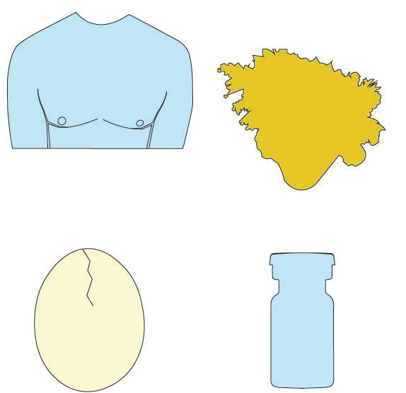
The first round of designs
|
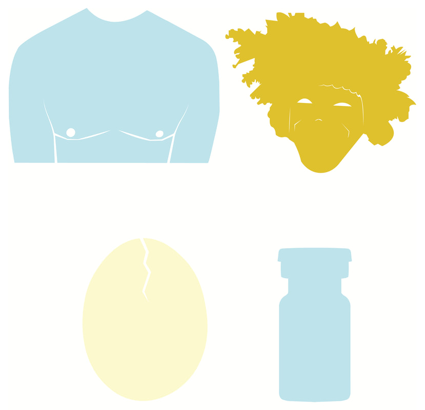
The second round of designs
|
I consider both of these groups first drafts. I personally find, these don't make for very interesting designs. Further, a few of them would have been very difficult to print on the vinyl cutter we were using for this project. Lines that were too close together or appeared very thin weren't easily cut in.
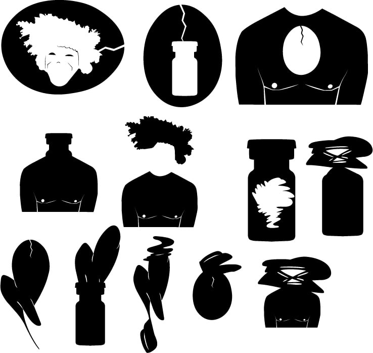
Fortunately, for the next round of designs we moved into abstract representations, with the goal of symbolizing our causes without real-world references. I feel, the designs I produced for this section were much more interesting to look at.
Fortunately, for the next round of designs we moved into abstract representations, with the goal of symbolizing our causes without real-world references. I feel, the designs I produced for this section were much more interesting to look at.

The third round of designs
However, during critique there was still some concerns about making these suitable for the vinyl cutter and further creating contrast between negative and positive space.
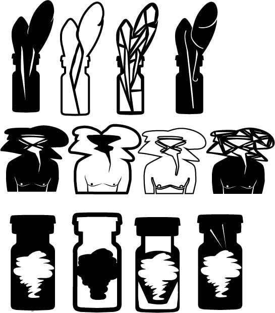
In the next round, we were instructed to create combinations of the different symbols we had made so far. Only two at a time.
In the next round, we were instructed to create combinations of the different symbols we had made so far. Only two at a time.
|
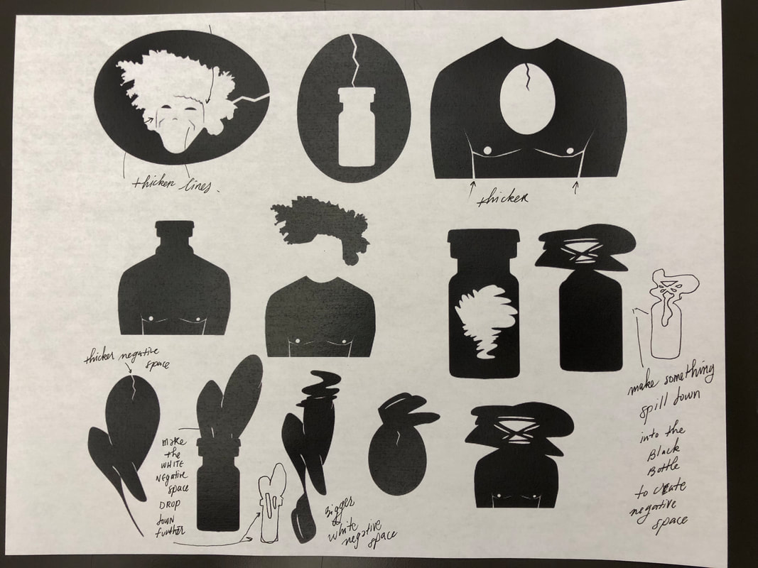
I managed to save some of the notes made by my classmates during the critiques for these designs.
|
After these critiques, I really took care to take the limitations of the vinyl cutter in mind without sacrificing my vision for the symbols. This led to the final round of designs, were we had to pick three combinations we liked and create three variations of each. This step was actually more difficult then I had anticipated, but I was really happy with the results.
|

|
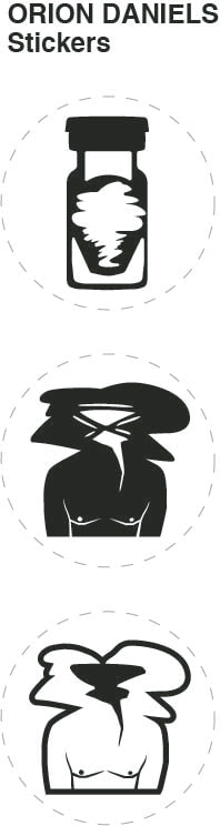
In the final part of the project, I just had to pick three design, and clean them up for printing. In the end, I did veto my classmates opinions because I really liked two of the variations I made for my second design. This part of the process was really focused on learning the technical aspects of adobe illustrator and the vinyl cutter.
|
This was a very fun project. I learned a lot about taking criticism and how to translate that into my work. I was also able to develop my Adobe Illustrator skills and learn about new technology.
|
|
