Graphing Mutual Aid Spending
|
The professor of my studio class had done some work with Austin mutual aid, a charity group run by volunteers. Our first project was to design a graph based on records of the group's spending.
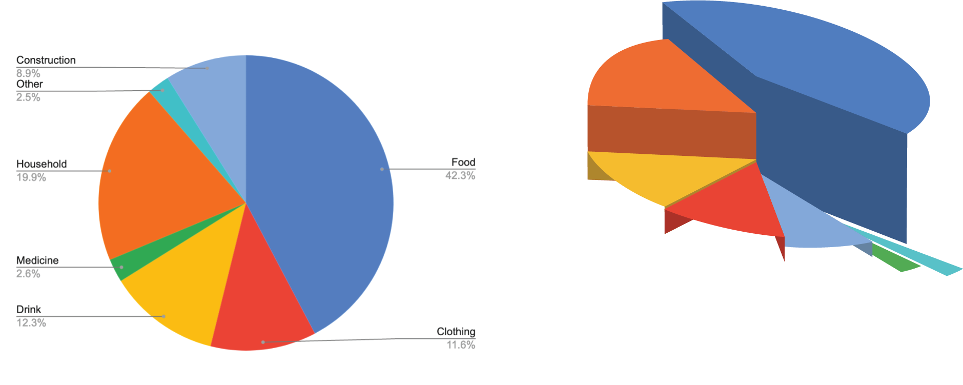
We were given raw data of items that had been bought for various charitable projects. Most commonly providing necessary items to the homeless but also other projects like building shelters. I decided to divide these into seven categories: food, household, Drink, Clothing, Construction, Medicine and Other. I started with rough sketches to build off of for the project. Given that I wanted to display the percent of money spent on certain items I decided a pie graft would best convey that information. |

|
The first designs I made were very simplistic with a focus on accurate information. Although I did keep some of the more dynamic elements from my original sketches. I knew for the second drafts that I wanted to make the whole thing overall more interesting.
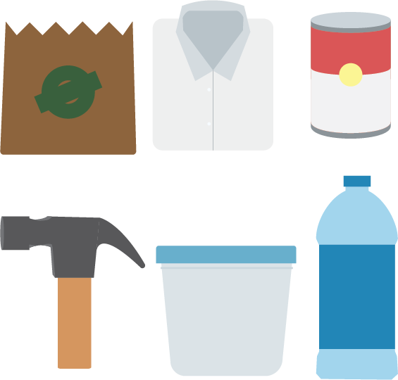
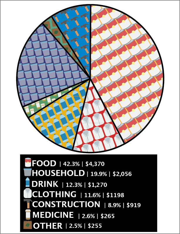
I started making small icons to go with each category I had set. Then eventually experimented with making patterns from these individual designs.


As you may already begin to see, at the time I designed these I wasn't completely familiar with some of Adobe Illustrator's functionalities. The patterns displayed were made using a pattern tool that comes with the standard software. However, I didn't notice the imperfections (or they didn't appear) until after the design had been exported to a jpeg. That's how I got to my second draft of the project.
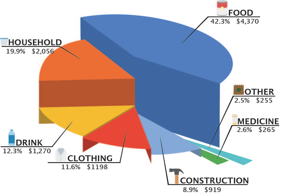
I decided to incorporate the icons I made into the other design I had made.
As one of the first projects I worked on this project helped me get a better understanding of the technical parts of adobe Illustrator and Photoshop. I also learned about displaying information and appealing visuals.
